The biggest mistake models make is applying makeup for the mirror; the final photo is a technical process that fundamentally alters color and texture.
- Color grading drastically changes a color’s brightness (luminance), which can make vibrant red lipstick appear black in B&W conversions.
- Professional retouching values authentic skin texture, not a ‘plastic’ look, making meticulous skin prep more important than heavy coverage.
Recommendation: To get predictable, high-end results, you must learn to anticipate the final grade by preparing your skin correctly and adjusting makeup choices based on the specific lighting and intended editing style.
You’ve spent an hour perfecting your makeup. The contour is sharp, the lipstick is vibrant, the skin is flawless. You look in the mirror and see a picture-perfect face. Then the photos come back from the shoot, and you barely recognize yourself. Your lipstick has turned into a dark smudge, your contour looks muddy, and your skin has a weird, unnatural cast. This frustrating experience is common for models who treat a photoshoot like a day out, rather than a technical performance.
The common advice is to simply “wear more makeup” or “use matte products.” But this rarely solves the core issue and often makes it worse. The problem isn’t just about the amount of makeup; it’s about a fundamental misunderstanding of what a camera and a colorist do. We don’t just capture what’s there; we interpret it. The choices you make in the makeup chair directly impact the flexibility and quality of the final image, long after the camera shutter closes.
The truth a colorist knows is that a photograph isn’t a mirror. It’s the result of a technical process where light is captured by a sensor, interpreted by software, and artistically manipulated through color grading. Your face is not just being photographed; it’s being processed. To look good in the final image, you must stop applying makeup for the mirror and start applying it for the grade. This is the secret to collaborating effectively with a creative team and ensuring your look translates powerfully on screen and in print.
This guide will walk you through the colorist’s perspective. We’ll explore why your makeup reacts in unexpected ways to light and editing, how to prep your skin for high-end results, and how to adapt your posing and makeup choices to work *with* the final grade, not against it. By understanding these principles, you can take control of your final image.
Summary: How Color Grading Transforms Makeup and Skin Tone
- Why Red Lipstick Looks Like Black Holes in Black and White Photography?
- Pores vs. Plastic: Why High-End Clients Want to See Your Skin Texture?
- How to Adjust Your Posing for High-Contrast Lighting Setups?
- The 3 Signs a Photographer Has Ruined Your Photo With Bad Editing?
- Gel Lighting: How to Pose When You Are Blue and the Background Is Red?
- Why Your Contour Looked Good in the Mirror but Muddy in the Polaroid?
- Clean Face vs. Moisturizer: What Exactly Does “Come Bare Faced” Mean?
- Why Your Skin Prep Before the Makeup Chair Determines the Shoot’s Success?
Why Red Lipstick Looks Like Black Holes in Black and White Photography?
The primary reason your vibrant red lipstick can turn into a dark, lifeless void in a black and white photo has nothing to do with its color (hue) and everything to do with its brightness (luminance). Digital black and white conversion is a process of remapping colors to a grayscale based on their luminance values. Colors that are inherently dark will appear dark gray or black, regardless of how saturated they are. This is a purely technical phenomenon that makeup must anticipate.
Red is a notoriously dark color in terms of its light reflectance. In fact, red reflects only 14% of light, whereas a color like yellow reflects over 70%, and white reflects 84%. When a camera sensor or editing software converts the image to monochrome, it sees that the red lips are not reflecting much light and therefore maps them to a very dark gray, often indistinguishable from black. Your bright, cherry-red lips suddenly have the same visual weight as a black hole.
To counteract this, makeup artists working for black and white shoots historically chose lip colors with higher luminance. A bright, almost neon pink or a coral-orange will have a much higher brightness value than a deep crimson or burgundy. When converted to black and white, these brighter colors will translate into a more pleasing, lighter shade of gray, preserving the shape and detail of the lips instead of crushing them into a dark mass. This isn’t an aesthetic choice for the mirror; it’s a technical decision for the final medium.
Therefore, if you know a shoot may involve black and white images, communicating with the photographer and makeup artist about using a brighter, higher-luminance lip color is a proactive step that demonstrates professional knowledge and ensures your features translate correctly.
Pores vs. Plastic: Why High-End Clients Want to See Your Skin Texture?
For years, the goal of beauty retouching was to create a flawless, poreless, almost plastic-like skin surface. However, the industry standard for high-end beauty and fashion campaigns has shifted dramatically. Today, authenticity is the ultimate luxury, and that means clients want to see real skin texture. They want to see pores, fine lines, and the natural, imperfect landscape of a human face. This doesn’t mean they want to see temporary blemishes or uneven skin tone, which is where a critical retouching technique comes into play.
This paragraph introduces the core concept of modern retouching. To better understand the difference between professional and amateur results, the illustration below shows a side-by-side comparison.
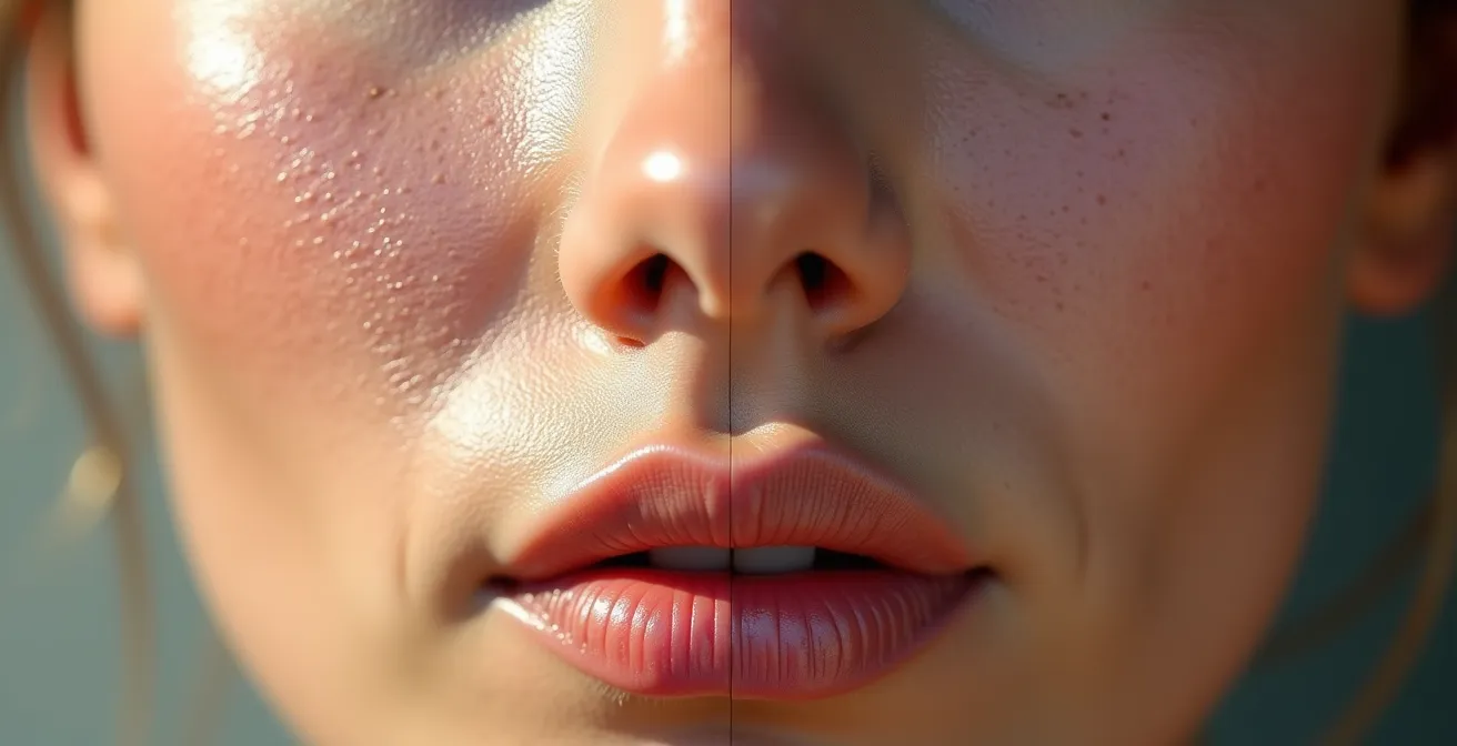
As you can see, the professionally retouched side retains the beautiful, intricate detail of the skin’s surface. This is achieved using a technique called frequency separation. Professional retouchers use this method to separate the texture of the skin (the high-frequency details like pores and fine lines) from the color and tone of the skin (the low-frequency information). This allows them to fix issues like redness, discoloration, or a temporary pimple without destroying the skin’s natural texture.
Case Study: Frequency Separation in High-End Retouching
According to insights from professional retouchers, top-tier beauty brands now include specific clauses in their briefs demanding that natural skin texture be preserved. They request that editors use frequency separation to correct color and tone issues while leaving pores and other fine details intact. This move away from “plastic skin” is a direct response to consumer demand for more authentic and relatable advertising. The technique is now the gold standard for luxury campaigns that aim to sell a product by showcasing its effect on real, beautiful skin, not a digitally created mask.
For a model, this means that arriving on set with a face caked in heavy, texture-hiding foundation is counterproductive. The goal is no longer to create a perfect canvas with makeup, but to present a healthy, well-prepped canvas that the makeup artist can enhance and the retoucher can perfect without erasing.
Your job isn’t to be poreless; your job is to have hydrated, healthy skin so that its natural texture becomes an asset, not something to be covered up. The most valuable thing you can bring to a shoot is skin that looks like skin.
How to Adjust Your Posing for High-Contrast Lighting Setups?
In a soft, flat lighting environment, your pose is primarily about the shape of your body. But in a high-contrast lighting setup—common in dramatic fashion, editorial, and commercial work—your relationship with the light becomes just as important as your pose. The deep shadows and bright highlights created by this lighting will be exaggerated even further in the final color grade. Your pose must anticipate this, using the light and shadow to define your features.
High-contrast lighting turns shadows into strong, defined graphic shapes. As a model, you need to think about the shape of your shadows as much as the shape of your body. This insight from a renowned lighting expert underscores the need for a new approach to posing:
In high contrast, shadows become strong graphic shapes. Models should think about the shape of their shadows as much as the shape of their body.
– Jake Hicks, Colour Grading Tips and Techniques
Instead of facing the light source directly, you must learn to work at the “terminator”—the edge where light transitions into shadow. By positioning key features like your jawline, cheekbones, or the bridge of your nose along this line, you create definition and dimension that will pop in the final grade. If you are fully in the light or fully in the shadow, you risk having your features either blown out (losing all detail) or crushed into blackness. Posing for high-contrast is a game of millimeters. A slight tilt of the head can dramatically change how a shadow falls across your face, sculpting your features in a way that makeup alone cannot.
Here are key strategies for posing in high-contrast scenarios:
- Position key features like your jawline and cheekbones right at the edge between light and shadow to create a strong, sculpted look.
- Keep the most important details of your expression or outfit in the mid-tones, not the deepest shadows or brightest highlights, to prevent them from being lost in post-production.
- Angle your body to consciously control the shape of the shadows you cast, using them as compositional elements within the frame.
- Use slight head tilts to catch reflector bounce in the shadow side of your face, which brings back a touch of detail and prevents the shadows from looking like a flat, black mass.
- Always check the photographer’s screen or ask for a test shot to see how the light is interacting with your pose and makeup, ensuring important details are being retained.
By treating light and shadow as partners in your pose, you give the colorist a rich, dimensional image to work with, ensuring the final product is dynamic and powerful rather than flat or murky.
The 3 Signs a Photographer Has Ruined Your Photo With Bad Editing?
As a model, receiving the final photos can be exciting, but it can also be disappointing when you feel the editing has done you a disservice. While art is subjective, there are technical mistakes in color grading that are universally recognized as poor craftsmanship. Knowing how to spot these issues can help you understand whether a photo is artistically stylized or technically flawed. This is crucial for curating a professional portfolio and for deciding which photographers to work with in the future.
The most common and obvious errors occur with skin tones and masking. A heavy-handed color grade can introduce “color contamination,” where the overall color cast of the image spills unnaturally onto neutral areas. A professional colorist takes great care to protect these areas. As professional colorists verify, all human skin tones align within a very narrow range on a technical instrument called a vectorscope, and straying too far from this line results in skin that looks alien, not stylized.
The following table, based on common issues discussed by post-production experts, breaks down the difference between amateur mistakes and professional execution. It serves as a clear guide to identifying technically flawed editing.
| Issue | Amateur Mistake | Professional Approach |
|---|---|---|
| Color Contamination | Whites of eyes turn blue/green from heavy teal grade | Precise masking protects neutral areas |
| Halo Effect | Bright/dark outline around subject from poor masking | Feathered selections blend naturally |
| Skin Tone Consistency | Face is orange while neck remains natural (“Fanta Face”) | Unified color grade across all visible skin |
The “Fanta Face” is perhaps the most infamous sign of bad editing. This happens when an editor applies a warming or tanning effect only to the face, neglecting to match the neck, chest, and other visible skin. A pro will always create a unified look. Similarly, a “halo” around your body indicates sloppy masking, where the adjustments for the background and subject don’t blend seamlessly. Finally, check the whites of your eyes and your teeth. If they’ve taken on a blue, green, or yellow tint from the overall color grade, it’s a clear sign of amateur work. Professionals will always mask and preserve these neutral areas to maintain a natural look.
Recognizing these technical red flags empowers you to critically evaluate your final images and build a portfolio that reflects high-quality, professional work.
Gel Lighting: How to Pose When You Are Blue and the Background Is Red?
Shooting with colored gels is a creative technique that can produce stunning, vibrant images, but it presents a unique challenge for makeup and posing. When you are lit with a strong color, like blue, and the background is another color, like red, your skin will be subject to intense “color contamination.” The blue light will reflect off your skin, neutralizing its natural warm tones and making you look pale or even sickly. Your makeup, especially, will react in unpredictable ways. This is where the concept of anticipatory makeup becomes critical.
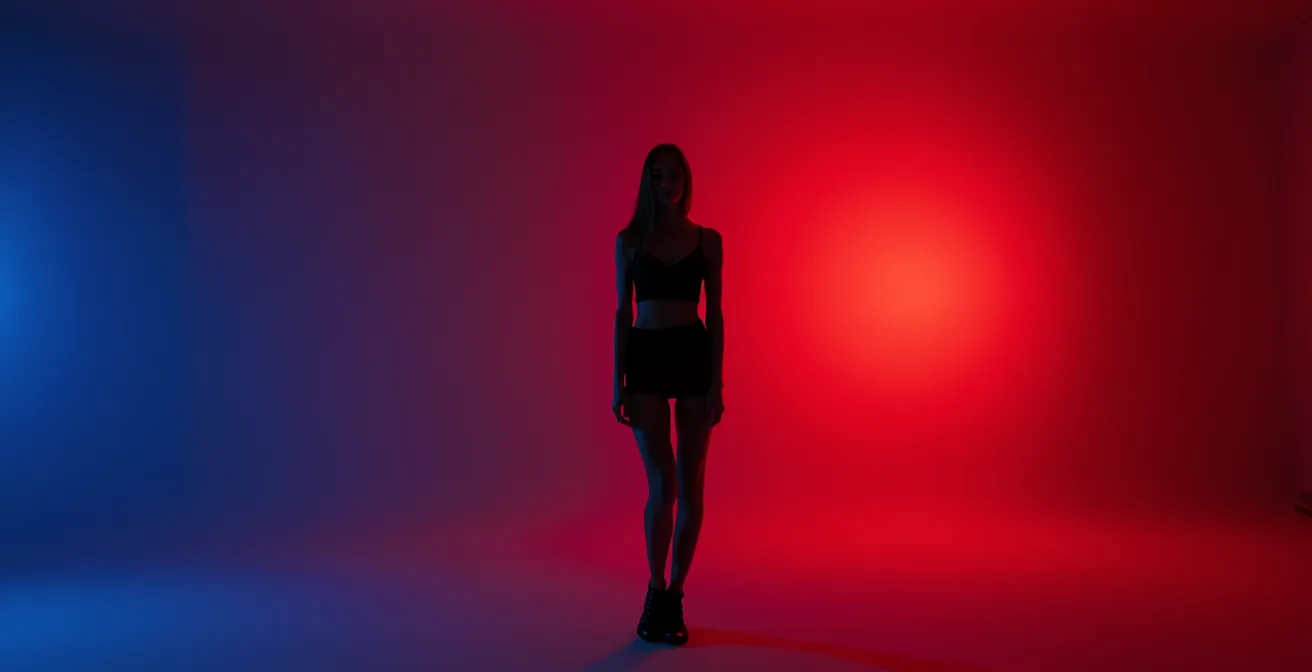
Your pose is your primary tool for controlling this color spill. Instead of facing the colored light directly, your goal is to position your body so that the colored gel acts as a “rim light” (highlighting your edge) while your face is turned toward a more neutral or white “key light.” This ensures your face retains its natural skin tone, creating a beautiful separation from the colored environment. By angling your body, you can control how much of the colored light “wraps” around you, turning it from a problem into a dynamic compositional element.
Case Study: The Star Trek Makeup Strategy
A classic example of anticipatory makeup comes from the cinematography of J.J. Abrams’ *Star Trek* films. To achieve a heavy, stylized blue color grade in-camera, scenes were often flooded with intense blue gel lighting. This lighting made natural lip colors look dead and gray. To counteract this, makeup artists painted the actors’ lips a shockingly bright magenta. In the mirror, it looked absurd. But under the heavy blue lights and through the camera’s lens, the blue light neutralized the excess pink, and the magenta lips appeared as a perfectly natural, healthy lip color in the final footage. This is a masterclass in using makeup not for the naked eye, but for the final graded image.
When working with gels, you must think like the *Star Trek* makeup artists. If you are being lit with blue light, a warm, peachy blush might completely disappear or look muddy. You might need a much brighter, cooler pink to achieve a “natural” look on camera. This requires communication with the creative team and, ideally, test shots to see how your makeup is reacting to the specific lighting setup. Don’t trust the mirror; trust the camera’s monitor.
By combining strategic posing to control light with anticipatory makeup choices, you can create breathtaking images that use color boldly without sacrificing the natural beauty of your skin tone.
Why Your Contour Looked Good in the Mirror but Muddy in the Polaroid?
The frustration of a perfectly blended contour looking like a muddy stripe on a Polaroid or film photo is a common one. The culprit is the difference in how digital sensors and analog film capture light and contrast. A digital camera has a wide “dynamic range,” meaning it can capture a great deal of detail in both the bright highlights and the dark shadows. This allows for soft, subtle gradients in your contour to be rendered accurately. You can blend a soft brown into your skin tone, and a digital sensor will see all the subtle mid-tones in between.
Film, and especially instant film like Polaroid, has a much narrower dynamic range and inherently higher contrast. It does not see those subtle mid-tones well. Instead, it tends to “crush” them, pushing lighter tones toward white and darker tones toward black. That soft, gentle gradient you created with your blending brush disappears. The film only sees the lightest part (your highlight) and the darkest part (your contour), creating a harsh, unblended line between them. What looked like a seamless shadow in the mirror becomes a dirty smudge on film.
To make your contour survive the transition to a high-contrast medium like film, you have to exaggerate it in a way that feels unnatural in the mirror. This means using products that are darker and applying them with more definition than you would for a digital shoot or everyday wear. The sharp edges that might look harsh in person are exactly what’s needed to create a defined, sculpted look on film. You are creating a contour that is resilient enough to withstand the “crushing” effect of the analog process.
Action Plan: Makeup Adjustments for Film and Polaroid Photography
- Go Darker: Apply your contour product 2-3 shades darker than you would for a digital photoshoot or daily wear to ensure it registers with enough depth.
- Embrace Matte: Use exclusively matte products for contouring and highlighting. Shimmer and glitter reflect light in unpredictable ways on film, creating distracting “hot spots.”
- Brighten Up: Increase the brightness of your highlight by 1-2 shades. This greater difference between highlight and contour creates the separation that film needs.
- Test with Your Phone: Before the shoot, take a photo of your makeup and apply a high-contrast black and white filter. This simulates how film might interpret the light and shadow on your face.
- Blend for B&W, Not for Color: Blend the edges thoroughly, but be less concerned with the color gradient and more with the softness of the transition line. Film will emphasize harsh edges.
Ultimately, makeup for film is not about creating a subtle, natural look for the human eye; it’s about creating clear, graphic shapes of light and shadow that the film can understand and record beautifully.
Clean Face vs. Moisturizer: What Exactly Does “Come Bare Faced” Mean?
The instruction to “arrive bare-faced” is one of the most common—and most misunderstood—requests in the modeling industry. Many models interpret this as showing up with completely dry, product-free skin. This is a critical mistake. When a makeup artist (MUA) asks for a bare face, they are not asking for dehydrated skin. They are asking for a clean canvas, free from any products that could interfere with their own professional application.
So, can you wear moisturizer? Not only can you, but you absolutely should. A well-hydrated face is the foundation of any good makeup application. Foundation will apply smoothly and evenly on plump, moisturized skin, whereas it will catch, flake, and crack on dry skin. The key is to use a lightweight, non-greasy moisturizer that can fully absorb, leaving no residue or texture on the surface. Similarly, clear, absorbed lip balm is essential. The MUA needs your lips to be smooth, not chapped. A non-tinted, fully absorbed SPF is also generally acceptable and a good practice for protecting your skin.
What the MUA is trying to avoid are products with active textures, like heavy, silicone-based primers. These can conflict with the MUA’s chosen foundation formula, causing a disastrous effect known as “pilling.” This insight from an industry professional highlights the technical problem:
If a model arrives wearing a silicone-based primer that doesn’t work with the MUA’s foundation, the products will ‘pill’ into little balls on the skin, ruining the base and wasting time.
– Professional Makeup Artist, Toolfarm Color Grading Tutorial
It’s also vital to be transparent about your skincare routine. If you have used strong active ingredients like retinol, glycolic acid (AHA), or salicylic acid (BHA) in the 48 hours before the shoot, you must inform the MUA. These products increase skin sensitivity and can affect how makeup sits on the skin or even cause a reaction when new products are applied. “Bare-faced” means a clean slate, but it also means an honest one.
By arriving with clean, hydrated, and non-interfered-with skin, you are not just following instructions; you are acting as a professional partner who respects the MUA’s process and contributes to the success of the final image.
What to Remember
- Luminance, Not Hue: A color’s brightness value determines how it will appear in B&W and high-contrast grades, making bright pink a better ‘red’ than crimson for monochrome.
- Texture is an Asset: High-end retouching preserves skin texture via frequency separation; over-smoothing with heavy makeup looks amateurish and is counterproductive.
- Makeup is Anticipation: Your application must account for the lighting, camera, and the final color grade, not just what looks good in the bathroom mirror.
Why Your Skin Prep Before the Makeup Chair Determines the Shoot’s Success?
The most important work for a photoshoot happens in the 24 hours before you even sit in the makeup artist’s chair. While a talented MUA can work wonders, they cannot create a healthy, hydrated canvas out of thin air. The condition of your skin is the single most important factor determining how the makeup will apply, how it will look on camera, and—crucially—how much time and money will be spent fixing preventable issues in post-production. A well-prepped canvas is the ultimate mark of a professional model.
Dehydrated skin is a retoucher’s nightmare. It creates micro-textures, causes foundation to look patchy and cracked, and emphasizes fine lines. Fixing these issues requires extensive, time-consuming texture work, often involving detailed frequency separation to rebuild a natural-looking surface. Studies of professional retouching workflows have found that images of models with well-hydrated, properly prepped skin require 40-60% less retouching time. This frees up the retoucher and colorist to focus on creative, artistic enhancements like color grading, rather than tedious corrective work. When you show up with great skin, you are directly contributing to a better, more polished final product.
A dedicated pre-shoot skin prep routine is not a luxury; it’s a professional responsibility. It ensures your skin is at its absolute best, ready to be a perfect canvas. Here is a simple but effective timeline to follow:
- 24 Hours Before: Focus on internal hydration. Increase your water intake significantly, aiming for 2-3 liters spread throughout the day.
- The Night Before: Perform a gentle exfoliation. Avoid harsh physical scrubs and opt for a mild enzyme or AHA-based treatment to slough off dead skin cells without causing irritation.
- The Night Before: Follow exfoliation with a deeply hydrating overnight mask or a heavy-duty moisturizer to lock in moisture while you sleep.
- Morning of the Shoot: Cleanse your face with a gentle, non-stripping cleanser. You want to remove any excess oil or product from the night before without stripping your skin’s natural moisture barrier.
- 2 Hours Before Call Time: Apply your lightweight, non-greasy moisturizer and give it ample time to fully absorb into the skin.
- 30 Minutes Before Call Time: Apply a nourishing lip balm. Just before you enter the makeup chair, blot off any excess so the lips are smooth but not slippery.
By understanding the journey your image takes from the makeup chair to the final delivery, you shift from being a passive subject to an active collaborator. Start implementing these preparation and application principles today to ensure the beauty you create in the mirror is the beauty that shines through in every final photograph.